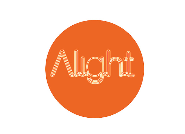
Here i have re-designed it to have the capital 'A' involved. And have tried different glows as well as trying different styles within the glows. for eg. linear dodge, colour burn etc.. to see what different looks it gave the glow. Again it's all for experiment so not expecting to use some of these colours for the final brand.
Helen Coghlan
Friday, 9 December 2011
Thursday, 8 December 2011
Lower case 'a' on alight glow designs...
Below are some of my more developed ideas for the brand. After my last tutorial last week where i had to rebuild my text, i have rebuilt it slightly differently with a small 'a', as when asking some peers with the capital 'A' in the way i had designed it it to some people looked like the word 'Night'. So here i have adapted it slightly seeing what it would look like in all lowercase. I have experimented with some of the glow effects, although some are on different coloured backgrounds, it is just for experimentation purposes. I have re-built my logo to have all rounded edges and a 3pt stroke as the thickness.
Monday, 5 December 2011
Another interesting link!!
Here is another link to a site i have found which has loads of interesting work on. Not just typography but everything!!
http://ffffound.com/
http://ffffound.com/
An Inspirational Site!
Heres a link i have found that is both nice to admire as well as good for inspiration considering the amount of work on there!
http://www.typographyserved.com/
http://www.typographyserved.com/
Monday, 28 November 2011
Subscribe to:
Posts (Atom)


