Tuesday 15 November 2011

Cultural–Olympiad

Here is another link. It's for the same website just in a different area. This part of the website explains more about the cultural olympiad. What it is and what is included in what they do. It also shows the other events they hold throughout the year not just the even that will be held in sheffield. Here is the link below.


http://www.london2012.com/cultural-olympiad

Alight Festival Sheffield

I found this link which I found useful for research. It has a lot of information about what events go on throughout the whole festival including bands and different performances that are occuring. It has different tabs for the different parts of the day, evening and late night holding information on whats happening when and where. This is the link for this website.


http://festival.london2012.com/events/9000961933

Tuesday 8 November 2011

Action Plan

Here are some bullet points I have made for my action plan for the flux brief part two..


1. Research quotes, poems, songs with history or meaning behind it.
2. Choose a quote and create further research from the topic.
3. The letterpress workshop- Write up after session.
4. Gain more experience in using the letterpress by using it in my own time.
5. Draw up compositions/ layouts.
6. Practice Kerning with text. ( useful websites to help with this as an online test.)
7. Do Several typesetting exercises.
8. Make sure the quote i have chosen is put into a context for me to enable a good way of it being understood and presented.
9. Research fonts and decide which font is going to be suitable for my work.
10. Do a few mock-up examples for developing. (hand drawn.)
11. Develop mock-up pieces by creating them on the computer. Test out variations of colour and think about size and spacing of text and how the texts shape or composition can relate to the quote.

Monday 7 November 2011

Fonts

Eurostile


I found out that Eurostile was made in 1962. Although it wasn't from the year 1969. I researched the font and it has been used for many science fiction movies, posters, novels etc.. which also seemed ideal for the quote i am portraying. I also really like this sans-serif font. Its big and blocky but with nice smooth rounded edges to it. I think it looks neat big or small and whether its bold or regular. This is why is chose to work with this font.


It's a geometric sans-serif typeface designed by Aldo Novarese in 1962. Novarese originally made Eurostile for one of the best known italian foundries, Nebiolo, in Turin.


He developed it because although he had designed the similar microgramma, which came with a variety of weights, it had only upper-case letters. A decade later he designed Eurostile which added lower-case letters, a bold condensed variant, and an ultra narrow design he called Eurostile compact, for a total of seven fonts.


It is a very popular display font. It's linear nature suggests modern architecture, with an appeal both technical and functional. The squarish shapes with their rounded corners evoke the appearance of television screens of the 1950's and 60's. As such, it has found some popularity in contemporary graphic design, as well as in science fiction novels and film artwork.

Fonts

Syntax 


Syntax was a font created in 1969. I researched this as i was going to use a font from that year for my developed work. After researching it i didn't think it would look right even though it was from the year i'm interested in.


The syntax font family was designed by Hans Eduard Meier. Originally started with the sans-serif fonts,it was then expanded to include serif designs.
It was released in 1969 by d. Stempel Schriftgieberei the type foundry of Frankfurt am main. It was believed to be the final face designed by D.Stempel for foundry casting.


Original drawings were done in 1954, first by writing the letters with the brush, then redrawing their essential linear forms and finally adding balanced amounts of weight to the skeletons to produce optically monoline letterforms. Meier work on different weights and variations and in 1989 the metal design was digitzed by Adobe who then expanded the family to include bold and ultra bold weights resulting in the font having a family of 4 romans and 1 italic in the lightest weight fonts.


The syntax font was apparently described as similar to a renaissance serif called Bembo. The uppercase has a wide proportion and the terminals not being parallel to the baseline provide a combination and sense of animation.

The Information

I gathered information for the surrounding text from a website called 'History orb'. It showed me facts and events in history that happened every day in 1969. Some were small events that weren't particularly important or that some people wouldn't care about others were quite significant but none so much as man landing on the moon. As this covered information from all countries around the world there was quite a lot and there was often more than one event or fact for each day. This involved what was happening politically around the world as well as in the sports and music industries.

images of the man on the moon.


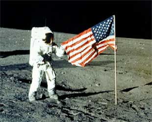
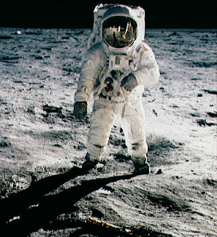
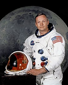
Here are some historical images from the time when Neil Armstrong first set foot on the moon. Some people apparently believed the whole thing to be a hoax. They questioned the images about how the shadows fell from the light etc... This clearly was not the case. Maybe it was disbelief in that they wouldn't really make it to the moon and back.?